Achieve Mobile Responsiveness for Your Website
In today’s digital world, having a mobile-friendly website is key for businesses to thrive. Most users now access websites on their devices. So, a good user experience is vital for better engagement and sales.
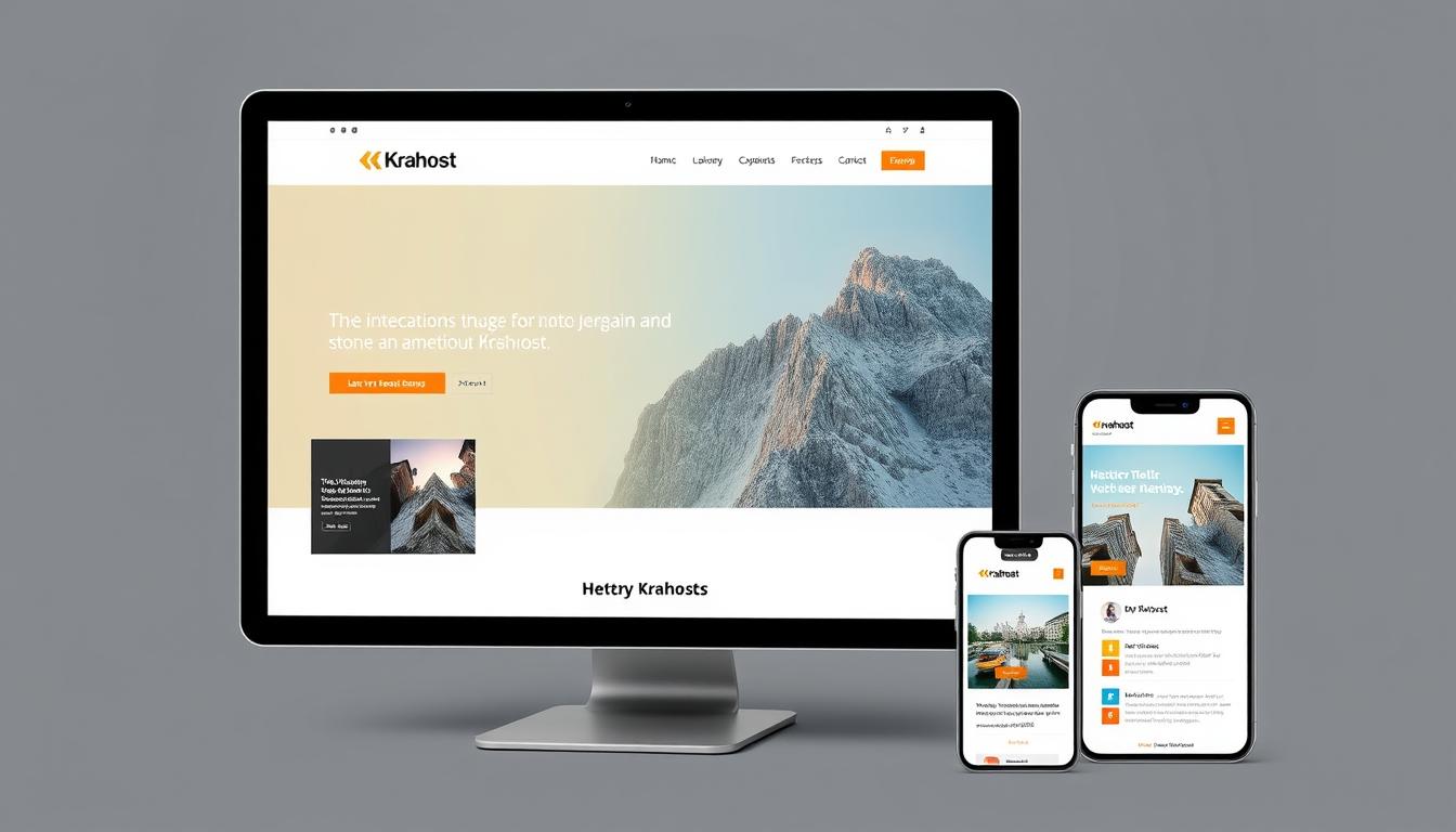
To make your website easy to use, think about using Krahost.com for hosting and domain registration. This way, your site will work well on all devices, giving users the best browsing experience.
Key Takeaways
- Having a mobile-friendly website is key for business success.
- A smooth user experience leads to more engagement and sales.
- Reliable hosting and domain registration are vital for a mobile-responsive site.
- A mobile-friendly website works well on all devices.
- Krahost.com offers reliable hosting and domain registration.
Understanding the Importance of Mobile Responsiveness
Mobile devices are everywhere in Ghana now. Having a website that works well on phones is key. It makes sure your website is easy to use and effective.
The Growing Mobile User Base in Ghana
More people in Ghana are using mobiles. This means businesses must focus on making their websites work on phones. Reliable hosting, like Krahost.com, helps make your website mobile-friendly.
Impact on User Experience and Engagement
A website that works on phones makes users happy. This leads to more people staying on your site and doing what you want them to. The benefits are:
- It’s easier to find what you need
- Pages load faster, so people don’t leave
- Everyone is happier with their visit
Business Benefits of Mobile-Friendly Websites
Mobile-friendly websites help your business a lot. They improve your ranking on search engines and make customers happier. This puts you ahead of others and helps you reach more people.
To get the most out of this, make sure your website is optimized for phones. Choose the right hosting and a domain that fits your mobile design.
The Fundamentals of Mobile Responsiveness
Mobile internet use is growing fast. This makes mobile responsiveness very important. A website that works well on phones and computers is key. It gives users a smooth experience.
Responsive Design vs. Mobile-First Approach
There are two main ways to make a website mobile-friendly. Responsive design makes a website fit different screens well. It looks good and works well on all devices.
A mobile-first approach focuses on phones first. Then it gets bigger for computers.
Key Components of Responsive Web Design
Responsive web design uses a few important parts. Flexible grids change the layout for different screens. Flexible images resize properly. And media queries apply styles based on screen size.
How Responsive Design Affects SEO Rankings
A mobile-friendly website helps with SEO rankings. Google likes websites that work well on phones. This makes them rank higher.
Responsive design also lowers bounce rates. This means people stay longer on your site. It’s good for SEO too.
Learning about mobile responsiveness can boost your website. It makes it better for users and search engines.
Assessing Your Current Website’s Mobile Compatibility
Mobile devices are now the main way people use the internet. It’s vital to check if your website works well on mobile. This helps you see what needs to be fixed to serve mobile users better.
Tools for Testing Mobile Responsiveness
There are many tools to check if your website is mobile-friendly. Google’s Mobile-Friendly Test tool is a top pick. It shows how your site does on mobile. Other tools like Responsively App and BrowserStack test your site on different devices and sizes.
Identifying Common Mobile Usability Issues
Some common problems include slow loading, hard navigation, and content that doesn’t fit the screen. Slow loading times can make people leave quickly. Difficult navigation can make users unhappy, hurting your site’s performance.
| Issue | Description | Impact |
|---|---|---|
| Slow Loading Times | Pages take too long to load on mobile devices. | High bounce rates and lower engagement. |
| Difficult Navigation | Navigation menus are not user-friendly on mobile. | Frustrated users and lower conversion rates. |
| Non-Responsive Content | Content does not adjust properly to screen sizes. | Poor user experience and higher bounce rates. |
Creating a Mobile Optimization Checklist
After finding the problems, make a checklist for mobile optimization. It should include tasks like making images smaller, simplifying navigation, and making sure all content works on mobile.
Google says, “a mobile-friendly website is key for a good user experience.”
“As mobile use grows, having a mobile-friendly website is essential, not just nice.”
Setting Up Your Development Environment with Krahost.com
Krahost.com is the perfect place to start your mobile-responsive website. First, you need to set up your development environment. This means picking the right hosting plan, registering your domain, and installing the tools you need.
Choosing the Right Hosting Plan for Responsive Websites
When picking a hosting plan with Krahost.com, think about your website’s needs. Reliable hosting services are key to keeping your site up and running. Krahost.com offers plans for all types of websites, so your site can handle more visitors.
Domain Registration and Management
Registering your domain is a big step in making your online presence known. Krahost.com makes domain registration and management easy. You can manage your domain settings and DNS configurations with ease.
Installing Development Tools and Resources
To work on your responsive website, you’ll need to install tools and resources. This includes code editors, version control systems, and more. Krahost.com helps you install these tools, making it easier to build a strong website.

Implementing Mobile Responsiveness with HTML5 and CSS3
Mobile responsiveness is now a must for websites. HTML5 and CSS3 are key to making this happen. With more people using mobiles in Ghana, a responsive site makes your online presence better on all devices.
Structuring Your HTML for Optimal Responsiveness
To make your site mobile-friendly, your HTML code needs to be flexible. Use semantic HTML elements and avoid non-semantic ones. For example, <header>, <nav>, and <footer> tags help define your webpage’s structure.
Steve Krug said, “Don’t make me think.” This idea fits well with the need for easy, responsive web design. A well-organized HTML document is key to a responsive site.
Essential CSS Techniques for Different Screen Sizes
CSS3 media queries are vital for changing styles based on screen size. They help control layout, spacing, and what’s visible on your site.
| Screen Size | Device Type | CSS Techniques |
|---|---|---|
| < 768px | Mobile Devices | Use flexbox or grid for flexible layouts |
| 768px – 1024px | Tablets | Adjust font sizes and margins |
| > 1024px | Desktops | Optimize for larger screen displays |
Using Viewport Meta Tags Effectively
Viewport meta tags are important for controlling zoom and scale on mobiles. They help ensure a good user experience.
Setting Up the Initial Viewport
Setting the initial viewport is key for correct display on mobiles. Include this meta tag in your HTML head: <meta name="viewport" content="width=device-width, initial-scale=1">.
Controlling Scaling and Zoom Behavior
You can adjust scaling and zoom by tweaking the viewport meta tag. For example, user-scalable=no stops users from zooming. But be careful, as it might affect accessibility.
Creating Fluid Layouts with CSS Grid and Flexbox
More people use mobile devices now, so making websites that work well on all devices is key. You’ll want your website to look good on any screen size or device.
Building Responsive Grids for Content Organization
CSS Grid helps you make complex, flexible grid systems for organizing content. You can define grid templates and use grid items for a layout that’s easy to keep up with.
For example, you can make a grid container with grid-template-columns set to repeat columns based on screen size. This ensures your content looks good on all devices.
Implementing Flexible Components with Flexbox
Flexbox is great for making flexible, responsive components. By setting display: flex on a container, you can manage its child elements easily. It’s perfect for things like navigation menus and button groups.
Practical Examples for Ghanaian Business Websites
Ghanaian business websites can really benefit from CSS Grid and Flexbox. An e-commerce site can use CSS Grid for a responsive product display. Flexbox is good for a navigation menu that changes with screen size.
Optimizing Images and Media for Mobile Devices
Optimizing images and media is key for a smooth user experience on mobile devices. With more people using mobiles, it’s vital to make your website work well on smaller screens.
Responsive Image Techniques and Best Practices
Responsive image techniques are essential for showing images right on different devices. Use the srcset attribute for various screen sizes and resolutions. This makes your website load faster and improves user experience.
Video and Audio Optimization for Limited Bandwidth
Optimizing video and audio is also critical, mainly in areas with slow internet. Compressing files, using streaming services, and lazy loading can help. These methods reduce media’s impact on your website’s speed.
Using SVGs for Fast-Loading Graphics
SVGs are perfect for graphics that need to change size without losing quality. They’re great for logos, icons, and other graphics.
Creating and Implementing SVG Icons
SVG icons are easy to make with tools like Adobe Illustrator. After creating them, you can add them to your HTML or use them in CSS.
Animating SVGs for Mobile Interfaces
Animating SVGs can make mobile experiences better. Use CSS animations or JavaScript libraries for engaging SVG animations.
Designing Mobile-Friendly Navigation Systems
A well-crafted mobile navigation system can greatly improve user engagement and website usability. It’s key to consider the unique challenges and opportunities of mobile devices when creating a seamless user experience.
Creating Effective Hamburger Menus
The hamburger menu is a key part of mobile navigation. It offers a compact and intuitive way to access menu items. Make sure it’s easy to find and use on smaller screens. Use a clear and recognizable icon, and think about using a slide-in or dropdown menu for navigation options.
Implementing Touch-Friendly Navigation Elements
Touch-friendly navigation elements are vital for a smooth mobile experience. Ensure buttons and links are big enough to tap easily, aiming for a size of 44×44 pixels. Also, add enough space between interactive elements to avoid accidental clicks.
Accessibility Considerations for Mobile Users
When designing mobile navigation, accessibility for all users is key, including those with disabilities. Use ARIA attributes to improve screen reader compatibility. Make sure your navigation works well with assistive technologies. This way, you create a more inclusive and user-friendly experience.
| Navigation Element | Best Practice | Benefit |
|---|---|---|
| Hamburger Menu | Use a clear and recognizable icon | Easy access to menu items |
| Touch-Friendly Buttons | Ensure minimum size of 44×44 pixels | Reduced accidental clicks |
| ARIA Attributes | Implement for screen reader compatibility | Enhanced accessibility |

Enhancing Mobile User Experience for Ghanaian Audiences
Improving mobile user experience is key to engaging Ghanaian audiences. You must consider unique factors for the Ghanaian market.
Optimizing for Common Devices in Ghana
Optimize your website for Ghana’s most used devices. Know the common mobile devices and their features. This way, more people can access your site.
Addressing Local Network Conditions and Limitations
Ghana’s internet speeds vary. Make sure your website loads fast, even on slow networks. Use image compression and caching to help.
Cultural Considerations in Mobile Design
Cultural aspects are important in mobile design. Your website’s design should match Ghanaian cultural tastes. Use images, language, and content that appeal to your audience.
By focusing on these points, you can greatly improve mobile user experience for Ghanaians. This leads to better engagement and more conversions.
Testing Your Mobile Responsiveness Across Devices
Testing your website’s mobile responsiveness is key. It ensures your site works well on various devices. With so many devices out there, it’s vital to check how your site looks on different screens and orientations.
Using Browser Developer Tools for Device Emulation
Browser developer tools make testing your site’s mobile friendliness easy. Most browsers have tools that let you mimic different devices and screen sizes. This helps spot and fix any issues with how your site looks on mobile.
Real Device Testing Strategies and Tools
While emulation is helpful, real device testing is more accurate. It shows how your site really performs on actual devices. You can test on real devices or use services that offer this kind of testing to ensure your site works well everywhere.
Automated Testing Services for Comprehensive Coverage
Automated testing services make testing faster by covering many devices and scenarios. They catch problems that might slip past manual testing.
Setting Up Automated Test Workflows
To make the most of automated testing, set up good test workflows. Decide what tests to run, choose the devices and browsers, and schedule the tests.
Interpreting Test Results and Making Improvements
After running tests, it’s important to understand the results. Look for issues like layout problems, slow loading, or broken interactive elements. Then, fix these problems to improve your site.
Troubleshooting Common Mobile Responsiveness Issues
Fixing mobile responsiveness issues is vital for a smooth user experience on your website. Even with optimization for different devices, problems can arise. It’s important to solve these issues to keep your online presence professional.
Fixing Layout Breakage on Small Screens
To solve layout problems, use a responsive grid system. Make sure your CSS media queries work for all screen sizes. Flexbox or CSS grid can help make your layouts flexible and adaptable.
Addressing Touch Target Size Problems
Touch targets need to be at least 44×44 pixels for easy tapping. Check your website’s interactive parts, like buttons and links, to see if they’re big enough. Making these changes can greatly improve mobile use.
Resolving Font Scaling and Readability Issues
For better font scaling, use rem or em units. Test your website’s text on different devices to keep it readable. This method ensures your text looks good on all devices.
Debugging Media Query Conflicts
When fixing media query issues, check your CSS rule order. Make sure specific queries take precedence over general ones. Use browser developer tools to see which styles are applied.
| Issue | Solution |
|---|---|
| Layout Breakage | Use responsive grid systems and correct media queries |
| Touch Target Size | Ensure targets are at least 44×44 pixels |
| Font Scaling Issues | Use relative units for font sizes |
| Media Query Conflicts | Order CSS rules correctly and use developer tools to inspect |
Conclusion: Maintaining Your Mobile-Responsive Website
Keeping your website mobile-friendly is key for a good user experience and business growth in Ghana’s mobile market. Regular updates and tests make sure it works well on all devices. Krahost.com offers reliable hosting and domain services for your mobile site.
Keep an eye on how your site performs and tweak it as needed. This ensures a smooth experience for users on different devices. Krahost.com’s hosting plans are made for responsive sites, helping you stay ahead of user trends and tech changes.
For a smooth-running mobile site, focus on ongoing care and improvement. With Krahost.com, your site is in safe hands. This lets you concentrate on expanding your business and connecting with your audience.